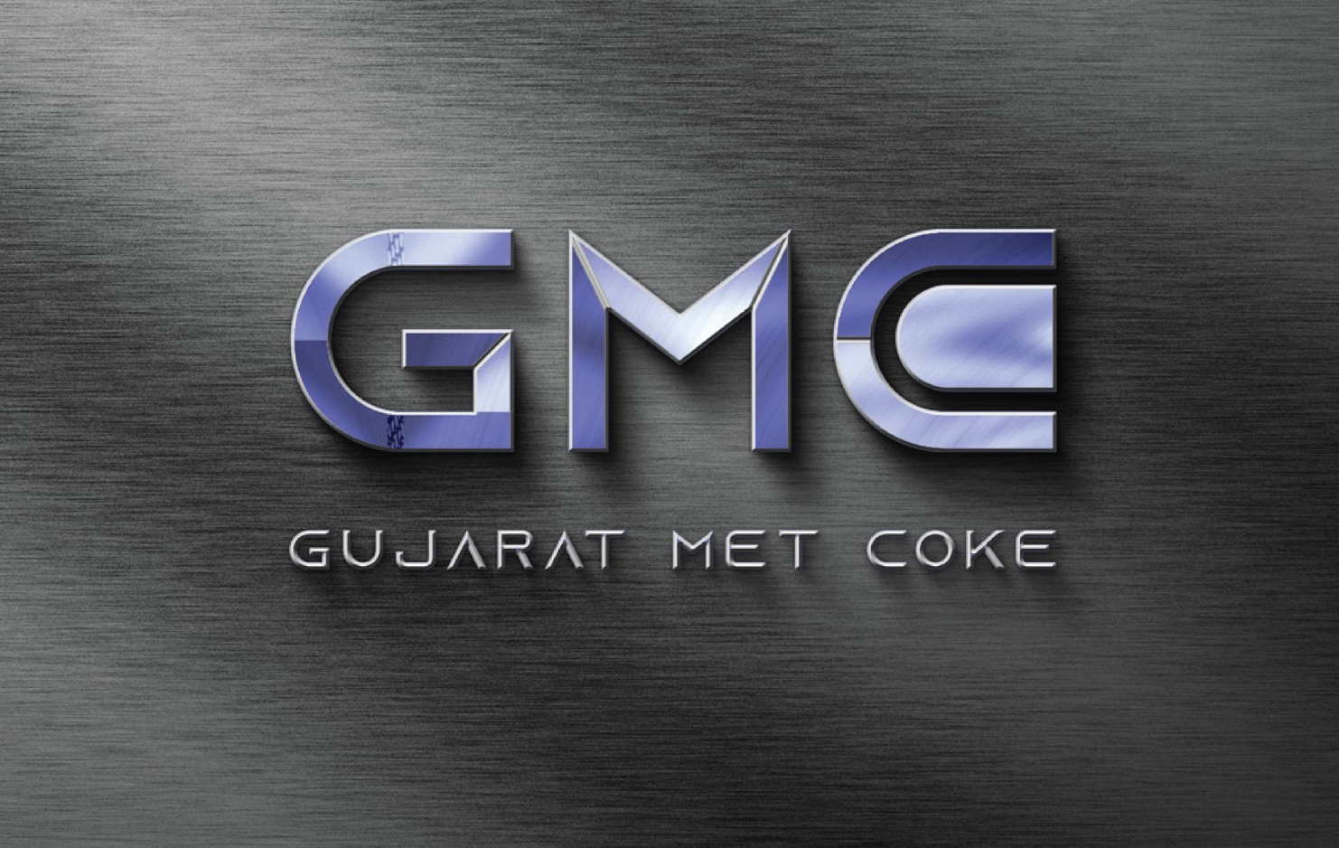
A bold industrial identity combining structure & movement.
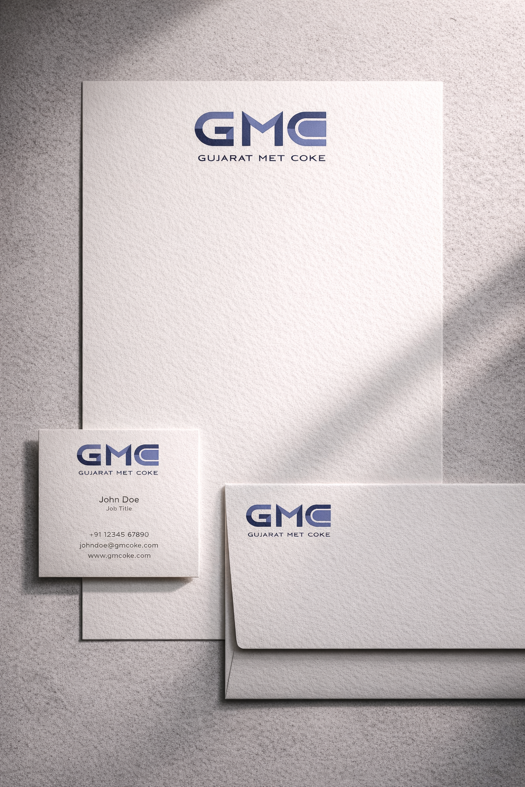
For GMC, the brief called for a logo that felt corporate and professional while still carrying a stronger visual presence within the industrial space. Unlike a purely typographic approach, the identity introduced a distinct design element that added character while maintaining clarity and readability.
The logo was developed to communicate strength, energy, and industrial reliability through balanced typography and structured form. The additional visual detailing helped the identity feel more distinctive while still remaining highly adaptable.
The result is a modern industrial identity that feels clean, confident, and visually memorable without becoming overly complex.